About that logo...
- organicfriend
- Jan 14, 2025
- 2 min read

“Looks like a piñata”
“An ovum being fertilized?”
“Something like a bug with other bugs coming out of the bug”
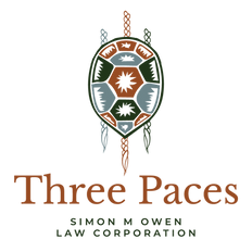
These were the initial assessments of Three Paces' review team (i.e. my three daughters) when I showed them the first draft of this logo. Their honesty is a gentle reminder of why I am a lawyer and not a graphic designer. Thankfully, the very talented and even more patient Emily Armstrong of Starling Memory Creative (who put the polish on this website) accepted the challenge of turning my mishmash of musings and doodles into an illustrative essence of Three Paces. That said, like the name itself, the logo probably merits a bit more explanation...
The shell, obviously enough, reflects the land we all live on. Turtle Island is a blessed, broken and incredibly resilient home to many Peoples, many species, many stories – and many laws. The left and right braids represent the two major strands that I work with every day: those laws we call “Canadian”, and those, with an often-lazy generality, we lump under the label “Indigenous” (this logo should have many more limbs). My work acknowledges these strands, their distinct histories, relevance, evolutions. And while they may look similar here (Emily wouldn’t let me get away with a torturously lopsided turtle), the laws of Canada and the laws of Turtle Island’s original Peoples will always be separate. Like the Two-Row Wampum agreements that the Haudenosaunee first offered to the Dutch over 400 years ago, this separation upholds (or should uphold) internal integrities, concurrent jurisdictions, and mutual respect.
So what’s with the middle braid? Well, at the same time that Indigenous and non-Indigenous societies are telling our own stories and determining our own laws, we are also, all of us, engaged in the ever-changing, never-finished work of living together. We are weaving braids of obligations, expectations, relationships – co-creations of what we need to live lawfully on these lands. Nourishing this centre braid, with humility, dedication, and a commitment to taking Indigenous laws seriously (Canadian ones don’t need much help in that regard) is central to the work of this wee outfit.
Three braids, one body – and we are all moving forward, pace by pace by pace.
I launch this logo with gratitude to Emily, to my keen-eyed and hard-nosed review team, and most of all to the Peoples whose laws have maintained Turtle Island from time immemorial, and who so generously share, with me and many newer-comers, what it takes to keep doing so.
Finally, I acknowledge that these symbols - the turtle's shell, the braids - are Sacred to many Indigenous societies, and have distinct meanings and importance to many people. Neither I nor Emily are Indigenous. We are not presuming to take on, take up or in any way interfere with Indigenous protocols regarding these symbols' significance or how they may be represented. We are also not aware of any specific ownership or other restrictions on how we are using them here. If you have any concerns, please let me know.


Comments